Accessibility tools that live inside phoenix_storybook:
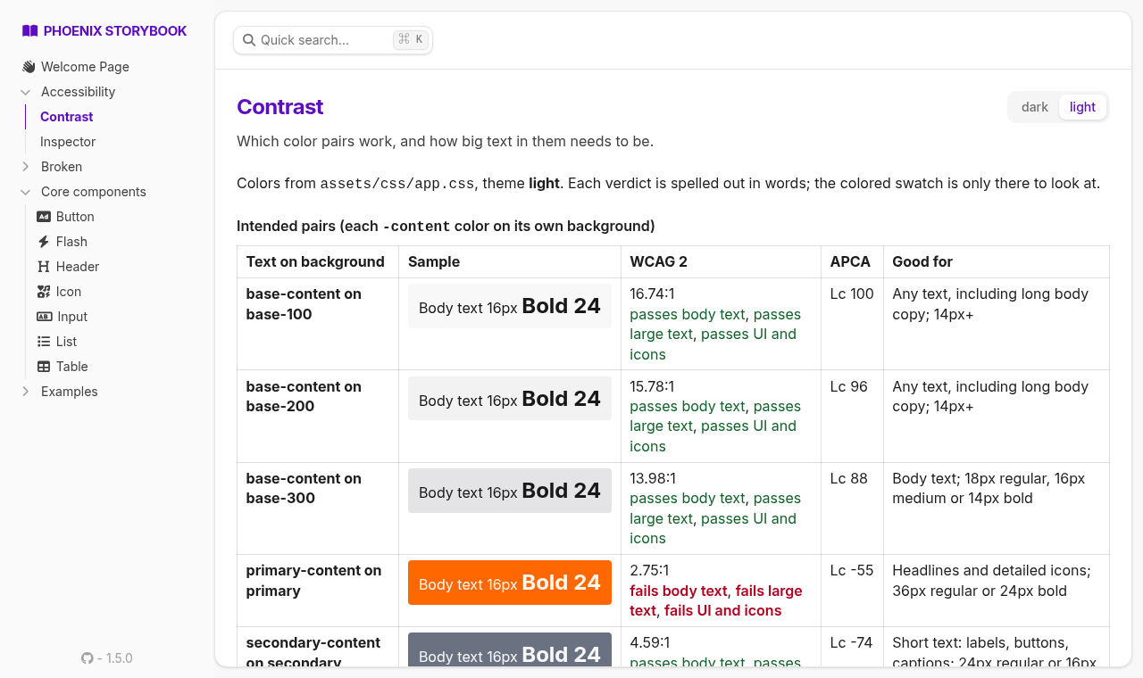
- Contrast: every text color on every background in your theme. You get the WCAG 2 ratio and the APCA contrast level, and the result says what each pair is good for ("body text", "short text: labels, buttons, captions", ...) and how big text in those colors has to be.
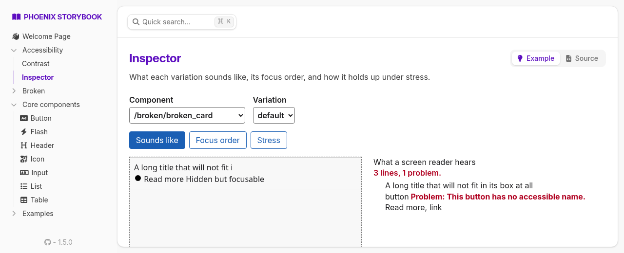
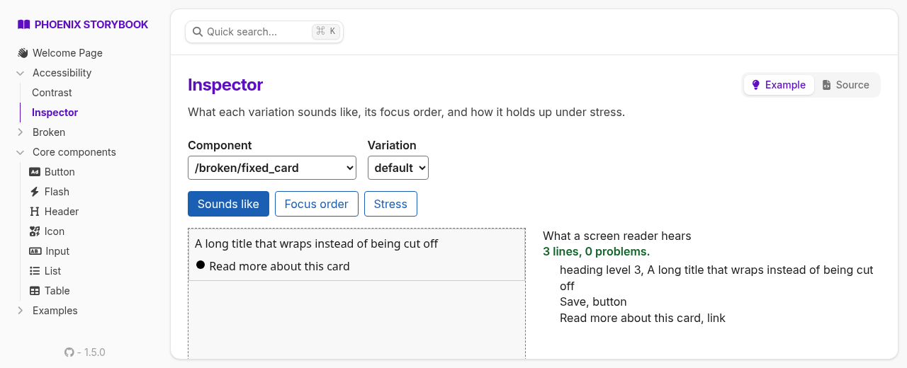
- Sounds like: roughly what a screen reader announces for a component, element by element, with anything unnamed called out.
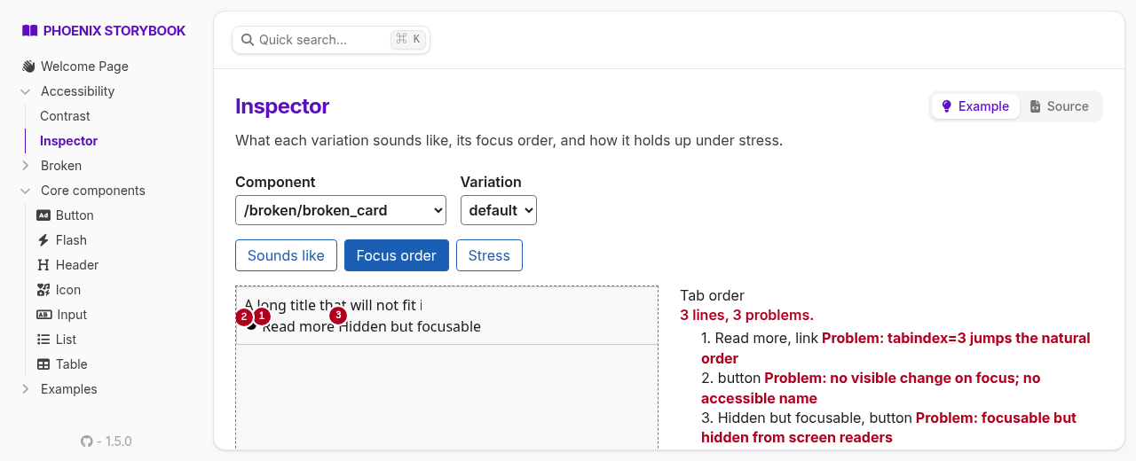
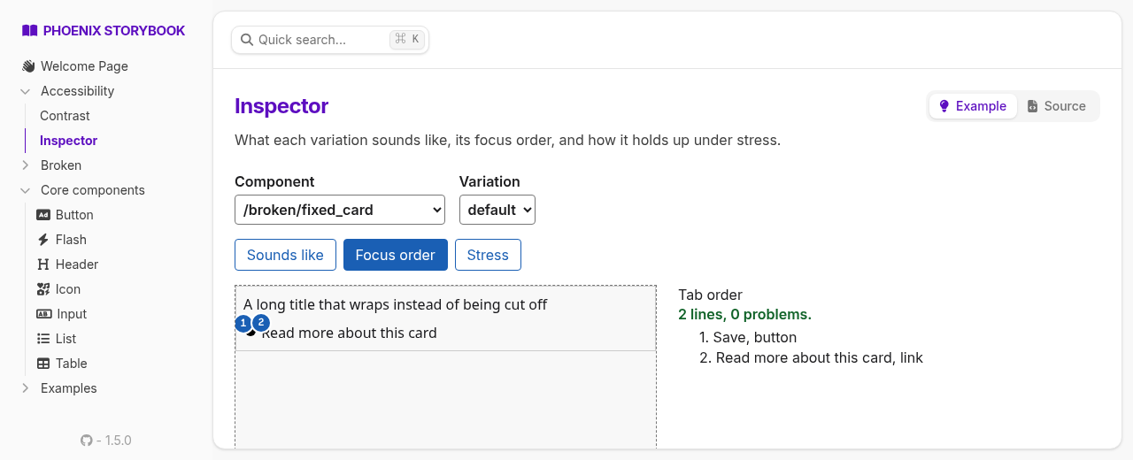
- Focus order: tab stops numbered on the component. It flags controls with no name, duplicate
names, positive
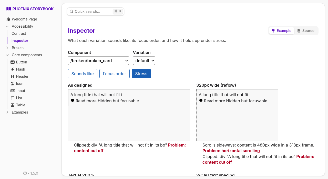
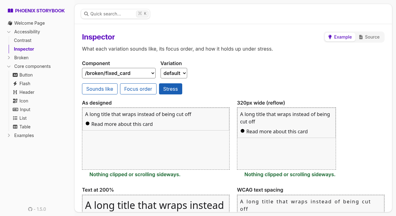
tabindex, focusable things hidden from screen readers, and focus that doesn't show. - Stress: the component at 320px wide, with 200% text, with WCAG text spacing, through color-vision filters and blur. Clipped content and sideways scrolling are reported.
Every result is written out in words; nothing depends on reading a color swatch.
This is for looking at your components while you build them. It is not a CI gate and not a verdict: automated checks catch a slice of real accessibility problems, and passing them says little about whether something is usable. For snapshot-based Pa11y/axe checks in your test suite, see Excessibility.
What it looks like
The same card twice: once with the usual mistakes, once with them fixed.
Installation
def deps do
  [
    {:excessibility_storybook, "~> 0.1", only: :dev}
  ]
end
1. Register the hook
In your storybook's JS (assets/js/storybook.js from mix phx.gen.storybook):
import { Hooks as A11yHooks } from "../../deps/excessibility_storybook/priv/static/excessibility_storybook.js"

window.storybook = { Hooks: { ...A11yHooks } }
If you already set window.storybook.Hooks, spread A11yHooks into it.
2. Add the stories
# storybook/accessibility/contrast.story.exs
defmodule Storybook.Accessibility.Contrast do
  use PhoenixStorybook.Story, :page

  # the stylesheet that defines your --color-* tokens
  @css Path.expand("../../assets/css/app.css", __DIR__)

  def navigation, do: ExcessibilityStorybook.ContrastPage.navigation(@css)
  def render(assigns), do: ExcessibilityStorybook.ContrastPage.render(assigns, @css)
end
# storybook/accessibility/inspector.story.exs
defmodule Storybook.Accessibility.Inspector do
use PhoenixStorybook.Story, :example
use ExcessibilityStorybook.Inspector, backend: MyAppWeb.Storybook
endIf your storybook isn't mounted at /storybook, pass storybook_path: "/your/path" too.
How it reads your theme
The Contrast page reads --color-* custom properties from the stylesheet, one tab per block that
declares them: a daisyUI theme (named by its name:), :root, [data-theme=...], @theme.
Colors can be hex, rgb() or oklch(), and var(--x) is followed through any custom property in
the file. Anything it can't resolve to a color (color-mix(), say) is listed as not measured,
never silently dropped.
Intended pairs follow the daisyUI convention: X-content is text on X, and base-content is
text on every base-*.
What it can't tell you
- Sounds like is an approximation. It's computed from the DOM with dom-accessibility-api; real screen readers differ from it and from each other.
- Components are static. The Inspector renders each variation with storybook's renderer straight into the frame (fast, no LiveView connection per frame), so JS hooks don't run. A state that only JS reaches, like an opened modal, needs its own variation.
- "No visible change on focus" is a heuristic. It compares computed styles before and after focus.
- The color-vision and blur frames are for looking at. They report the same clipping as the plain frame; they don't judge anything.
License
MIT. Vendors dom-accessibility-api (MIT), license in priv/static/vendor/.